

As content portals go, MSN has been the go to place for millions of people across the globe on a daily basis. It may not be your preferred destination for your up to date news, but it certainly can’t be denied that it has its fair share of traffic – and all this since 1998, that’s 16 years of internet time! And there maybe an argument around the number of Hotmail users that sign in to their accounts via the homepage, which drives the amount of traffic to MSN but even if you took a look at how much content is on MSN as a whole, then I am pretty sure there is something for nearly everyone there, to have a read of. But we are here today to take a look at the new offering MSN has rolled out as its portal for users.
How MSN has changed – since 1998
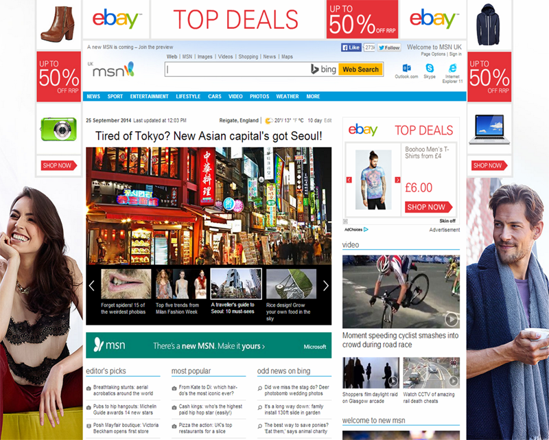
The issue MSN has as it currently stands, is quite plain to see from my most recent screenshot below, it’s a bit of a car crash when it comes to displaying the vast amount of content and advertising slots across its homepage and category pages. As far as I can remember when I used a Hotmail email (before having a Gmail) account, its been the same. It seems to lack focus for the user, I end up asking myself the same question when I am asked to review a site, “what do you want me to click on?”
I took a look back into web.archives.org to see if there were any major changes from MSN for their content portal. It was great to see and remember how “immature” the internet was back in 1998 for website and content delivery. There were some changes in the early years, from 1998-06 and then a few tweaks here and there to about 2008, but generally just reams of copy heavy links with little images (ok, granted that due to ad hosting, the screenshots don’t include some images – but you get my drift), there is even an advert for IE8 in 2010 – whoa…

In early 2010 they made a bigger change to the site structure and layout. As you can see from the screenshot below, they were using bigger images to draw the user in and a lot less clutter and links, but fundamentally the platform has remained the same.

Possibly, (and I forget myself) that’s how we digested content way back in 2006-10, just through a number of links and content on the portal itself, we could even suggest it was an SEO methodology eh?
The new MSN Content Portal – 2014
But I am not here to talk about the old MSN portal, its all about the new, and they seem to have changed it up a lot and for the better. Obviously due to the explosion and usage of devices, smartphones, iPads over last few years, and how we now consume content on the go, MSN have focused on mobile first and developed out – the true way to develop a site these days.
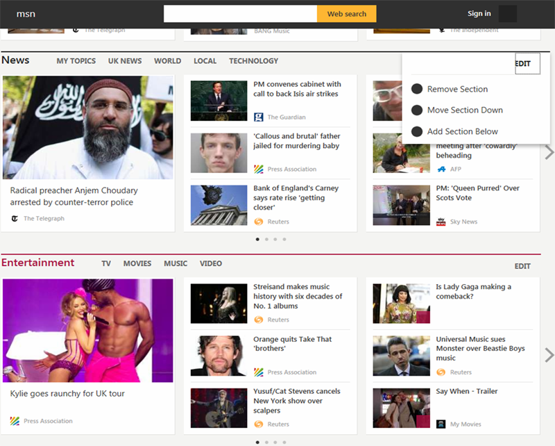
The new MSN layout, allows you to access the tools you’ll need daily with their “Services Stripe”, like your email, OneDrive, OneNote notebook and integrating sites like Facebook, Twitter to name a few, you can personalise these easily, like you would a toolbar.

They seem to have moved a step closer to what you, the consumer really wants too, being able to really personalise what you see and how you interact with content. You can reorder categories and interests that you want to see, regardless of what device you use – you set your favourites once, whether its food, sports, finance, weather or news and go from there. You can even delete sections that don’t interest you, so if food or sport isn’t your thing, just remove them from view.
The site isn’t cluttered anymore (see below), its easy to navigate and using big images across every section works well for the devices I tested it on and for drawing the user into each piece of content, for me its a bit step forward in the right direction.
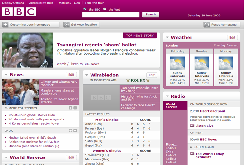
The BBC launched it in 2008
I remember the BBC doing something very similar when they launched their new site, where you could drag and drop categories of interest to you. It was a very bold move at the time for the beeb, but they didn’t fully roll it out which was a shame.
So it’s a thumbs up from me… (but will stick with Gmail)
It does seem like a cross-breed of Pinterest and Flipboard all in one place, which is great as it allows you to really personalise what you want and where you want it, sorting your favourites once and as long as you are signed in to your account, you will have one consistent experience across any of the devices you own. Use of big images with a headline to draw you into the content is the “norm” these days and it works well for me.
Two things that stood out for me, maybe because they are in Beta phase and rolling it out, so will see with time, but a lack of adverts across the beta version and the content isn’t “owned or developed” by MSN. The latter they say is due to them partnering with the worlds biggest news and publishing platforms to deliver the content you want, such as:
- US – The New York Times, The Wall Street Journal, The Washington Post, CNN, AOL (including TechCrunch and Huffington Post) and Condé Nast (including Vanity Fair, Epicurious, Bon Appétit).
- Worldwide – The Yomiuri Shimbun and The Asahi Shimbun in Japan; Sky News, The Guardian and the Telegraph in the UK, NDTV and Hindustan Times in India, Le Figaro and Le Monde in France, and many more
Overall a good move for MSN as a platform, they seem to have finally caught up and looking towards the future to what users want from as a publisher/platform. I can’t begin to think of how much was spent or the headaches it caused from user testing and development point of view, but we don’t need to think about that, just give it a go for yourself and see what you think – the new MSN portal.
PS – Oddly, and I am not sure if its just my browser settings but it doesn’t render correctly using IE9, ouch!


